If you or your company has a website receiving a fair amount of traffic, then chances are you’ve questioned its effectiveness regarding conversions that how we increase the conversion rates of our website.
Landing pages can generate high amounts of quality leads but only if they are well designed. This might seem easy but unfortunately, it’s not that easy. A typical landing page is easy to build but the real challenge is in creating a qualitative and engaging landing page. If you want a high-converting landing page then it must be built in a way that captures the visitor’s interest in what you are offering.
These are the 10 tips to help you design a great landing page:
1. Core Elements For Effective Landing Page
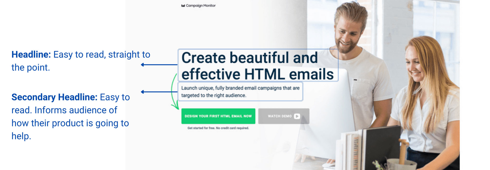
The heading, subheading, visuals, explanation, contact information, CTAs, and landing page form are the main elements of a high-converting landing page. All these factors are major thing which can increase conversion rates. The proper application of these crucial elements will result in an engaging landing page. Many of these elements are underappreciated, and many people overlook them, but this is where they go wrong. Furthermore, many people use them but are still unable to create a converting landing page because they do not test their page. A/B testing allows you to determine what is important and what should be removed from your page.
2. Make your Call To Action Abundantly Clear
CTAs, such as “click here for more information” or “sign up here,” are short texts that direct customers. Only when your CTAs are simple, sweet, and conveying will they serve a purpose. What If you are talking about free access in your heading but when customers click on your CTAs they are asked to pay subscription fees? This diminishes their faith in your service. So there should be no flaps and your landing page must be relevant to your CTA’s and the other way around. In this way you can increase conversion rates of your website.


3. Keep Your Offer Concise
The landing pages that present their offer in a typical way attract fewer customers. The description of your offer must be written in a way that fulfills their need or solves a specific problem. For example, instead of writing “Our XYZ service features this”, use “Our service can enhance your productivity by 50%”. Content is all based on engagement, if what you are offering does not solve or help the customer, then it is serving no purpose. Try to focus on one specific offer.
4. Keep It Short And Simple
Even now you might be judging this article by its length and quality. If you have come so far to read this, then it must have kept you engaged otherwise you would have stopped reading all the way up. That’s why content quality and length matter. Great landing page design consists of short, simple and engaging content. If the content is confusing and too wordy then it will lose the customer’s interest. Especially, the headings and the subheadings must be crystal clear in conveying the message. Opt for small and purposeful headings.
5. Use Creative Visuals
Pictures will always catch more attention of users than text. So make sure to use creative visuals to grab the user’s attention. However, your visuals must be relevant to what you are offering. Videos are another way to blossom up your landing page but remember not to overwhelm your landing pages with them. Creative visuals also increase conversion rates.
6. Testimonials
Testimonials are like reviews but not of a product but instead of a brand and the service it offers. Research has shown that more than 50% of people trust the opinion of ex-users of a particular service. Always try to add former customer reviews on your landing pages. This will create faith in the users and they will trust you for your service. You can add pictures or videos to your testimonials for a more creative engagement.
7. Warranty
Customers are more likely to pursue your service if they are confident in the product or service they are about to purchase. A warranty assures them that you have their back if something goes wrong.
Warranty is essential for a high-converting landing page as it boosts their confidence in you.
8. Discomfort Then Please
You might be thinking, why discomfort the customers? Wouldn’t this cause us to lose them? No doubt everyone wishes to avoid distress and gain pleasure but the point here is that we want to engage them with our offer. Your landing pages content should be written in such a way that it first makes the user uncomfortable about their problem and then provides a convenient solution to it, which would be your offer. As a result, it is also critical to conduct research on the target audience’s problem.
9. Create a Frictionless Lead Capture Form
Customers will be directed to the form page if your CTAs are flawless. Your lead capture form must be concise and not too long, or else it will frustrate the audience and they will not bother filling it out. So avoid asking for too much personal information on your landing pages and keep the spacing short as well.
Conclusion
In order to create a high-converting landing page, you must first conduct thorough research on your target audience and understand their needs and problems. Then make an offer to solve their problem. Concentrate on writing concise, precise, qualitative, and engaging content. In addition to text, include appealing visuals to increase involvement. Try to include testimonials to increase customer trust. Finally, no matter how accurate you believe your landing page is, it is critical that you always conduct A/B testing in accordance with your business. These tips will surely help you design a great landing page.


One reply on “9 Tips to Increase Your Landing Page Conversion Rates”
hi